


1
2
3
4

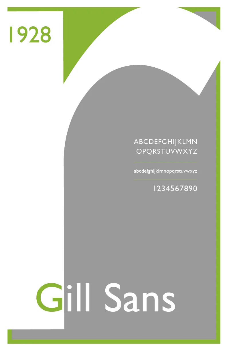
I wanted to create a type specific series of posters that displayed Gill Sans sleek and modern. Gill Sans is such a fascinating typeface. You could do a completely different poster for each of the different weights in the type family. The colorful layouts of the posters express the whimsical nature of the typeface but each is in a box that reminds the viewer of Gill Sans’ geometric nature. The G poster is my favorite because despite the cliche of the type specimen poster using the G. Gill Sans has such an interesting approach to the shape of a G that makes it unique from other typefaces.