Due Sept. 14
Fingerprint or Identity or Self-Portrait
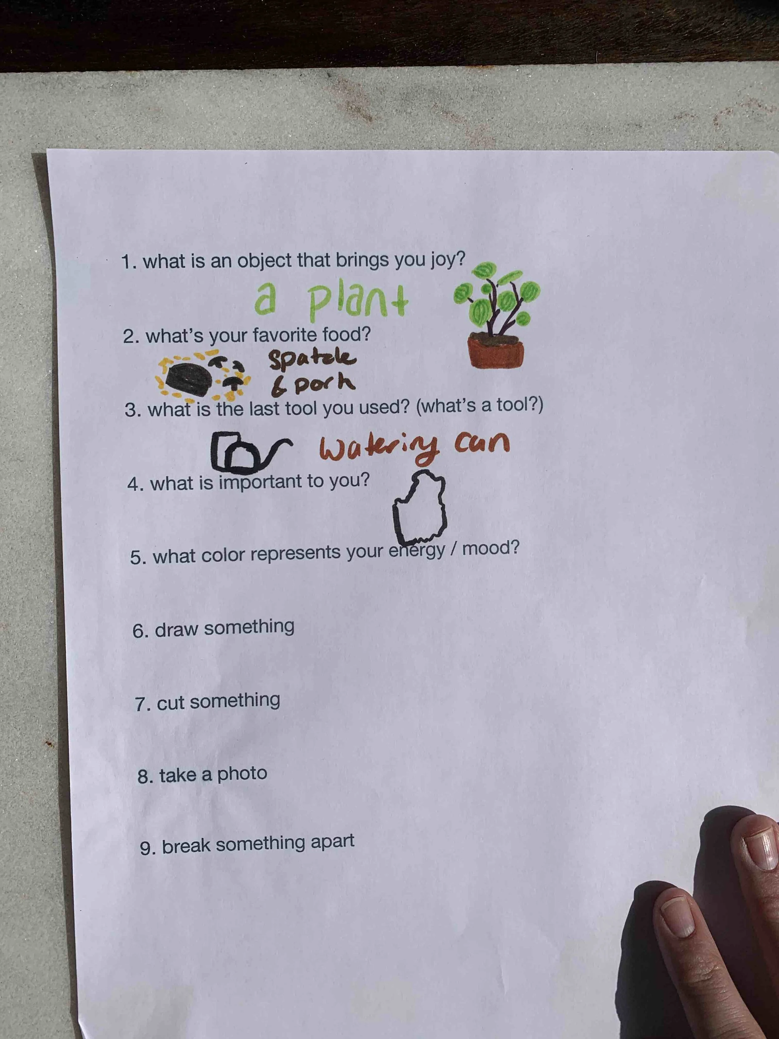
what is an object that brings you joy? a plant
what’s your favorite food? french fries
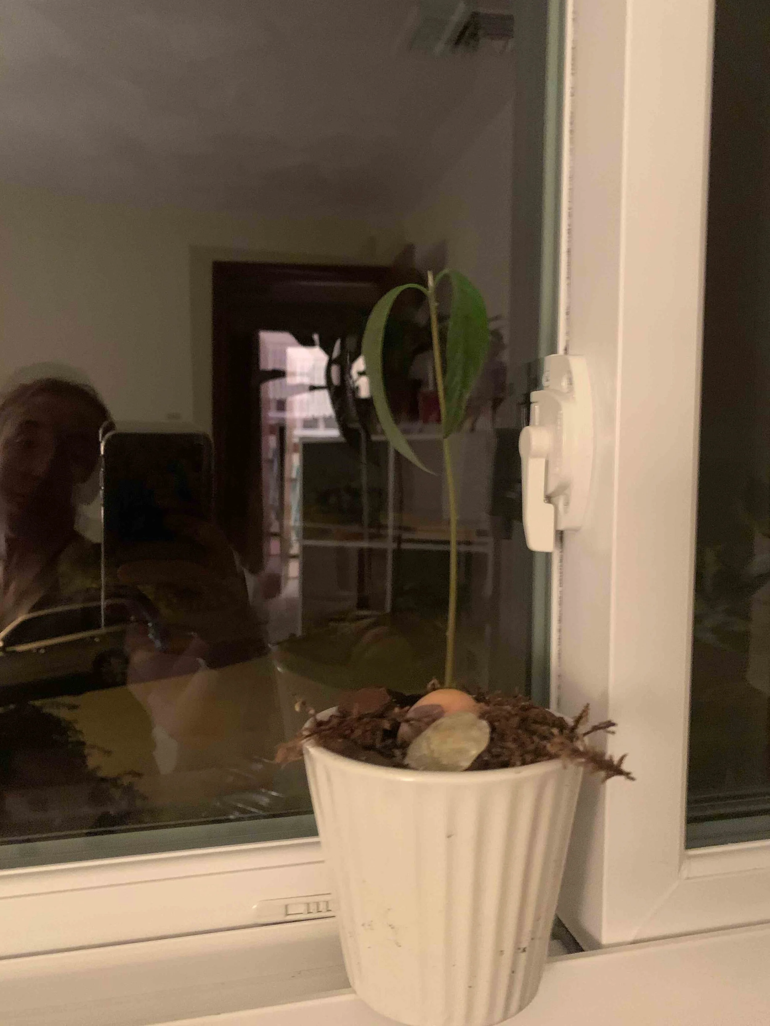
what is the last tool you used? (what’s a tool?) watering can
what is important to you? Maine
what color represents your energy / mood? yellow
draw something
cut something
take a photo
break something apart
This was a fun project! I have created a gallery below that shows my process sequentially
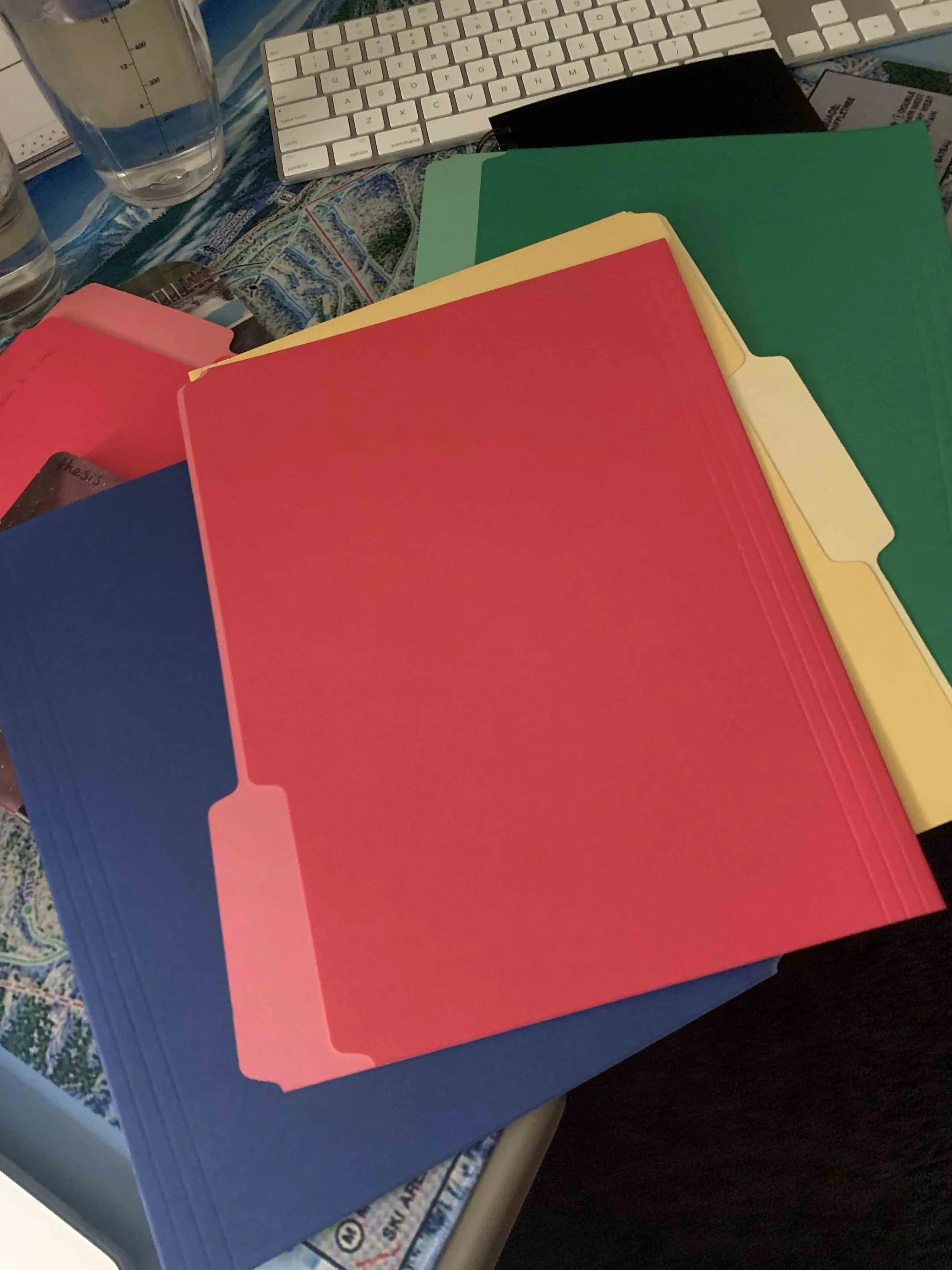
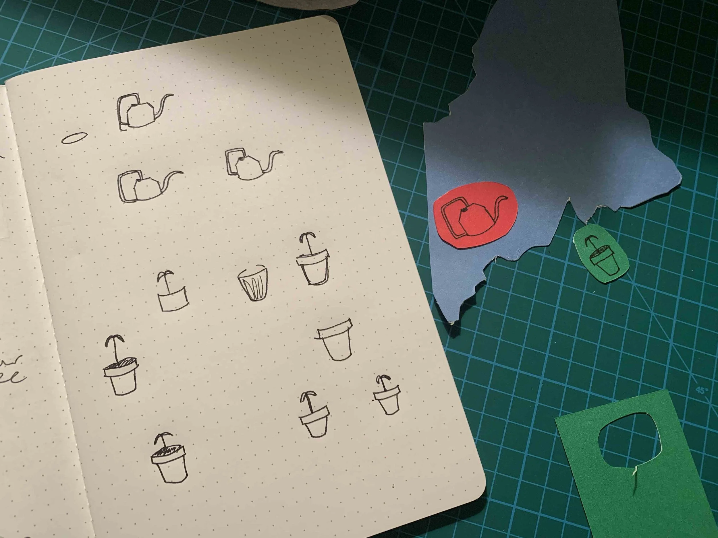
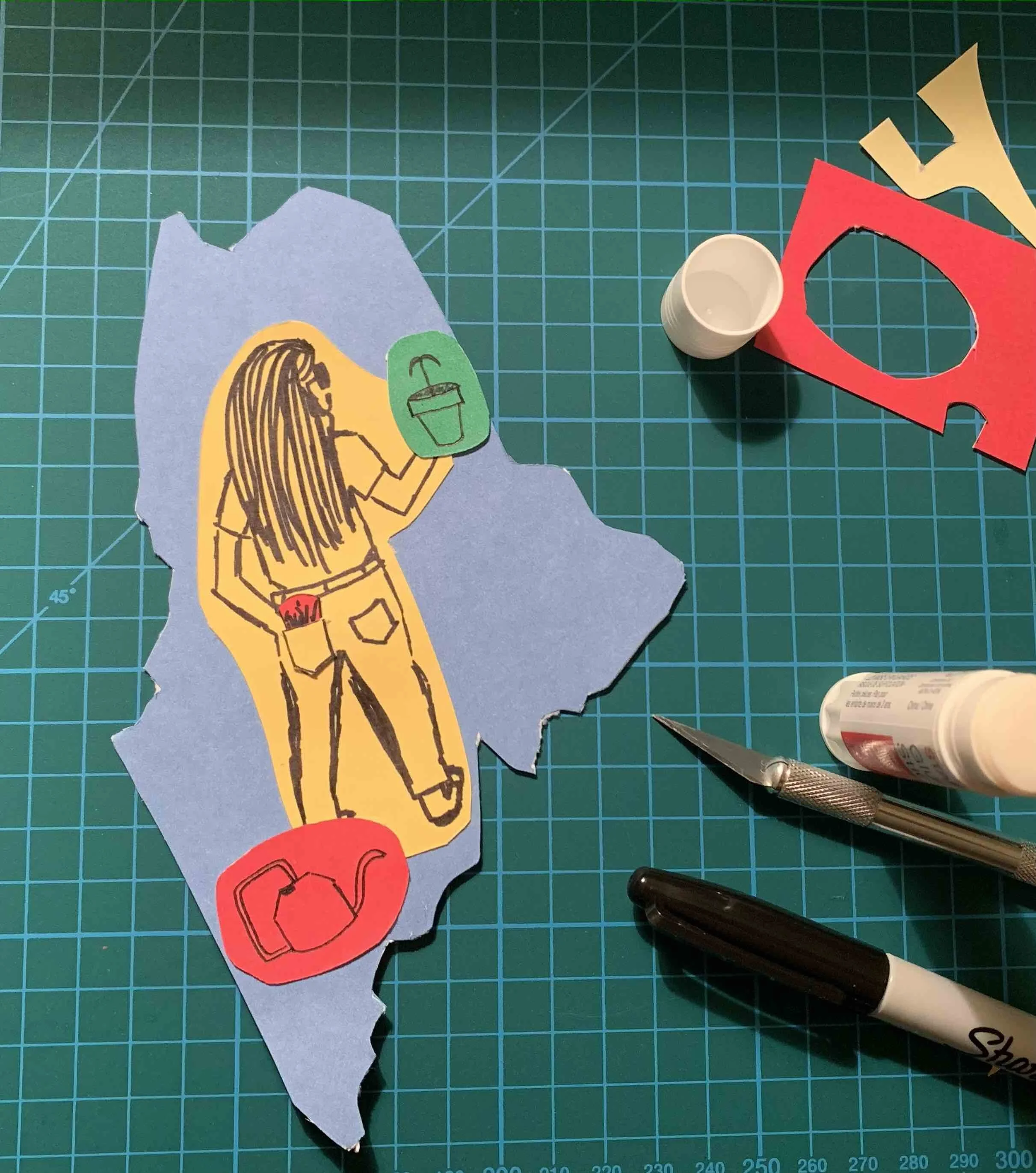
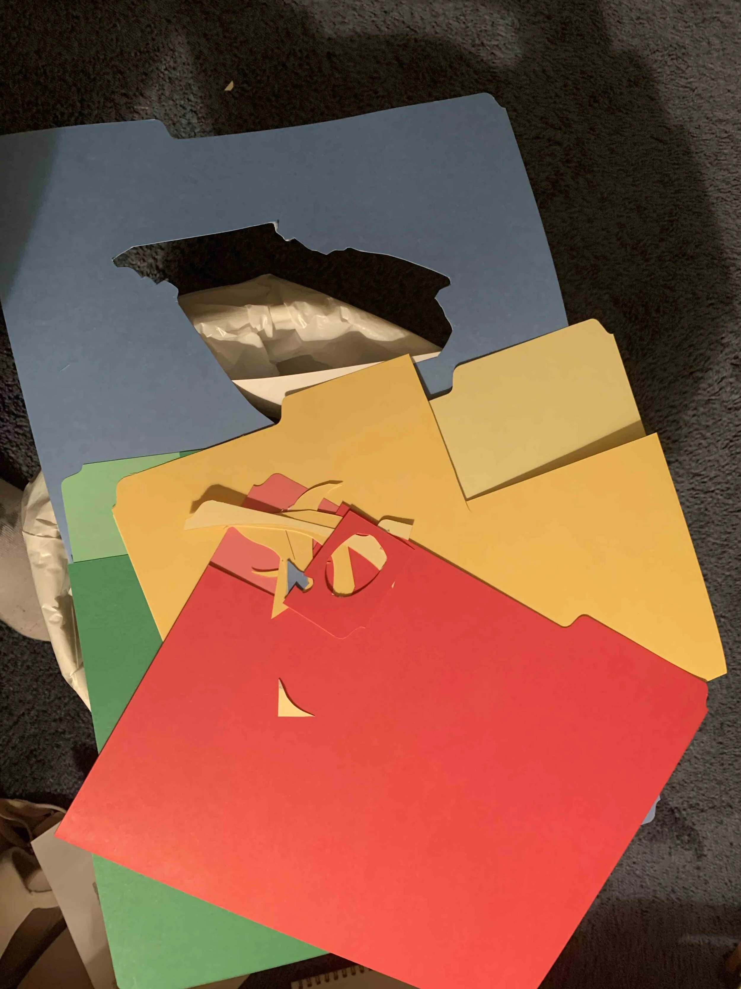
I started by taking this list of 9 actions putting them into a word doc and printing it out and then writing/drawing the answers and imagining how this would come together. I wanted to do a collage of some sort. But I didn’t have any colored paper other than some file folders but if I cut shapes out of the file folders and drew on them that would cover 6,7 & 9 on my list of things to accomplish :) I chose to illustrate with a black pen and sharpie to be easy to see on my colorful paper.
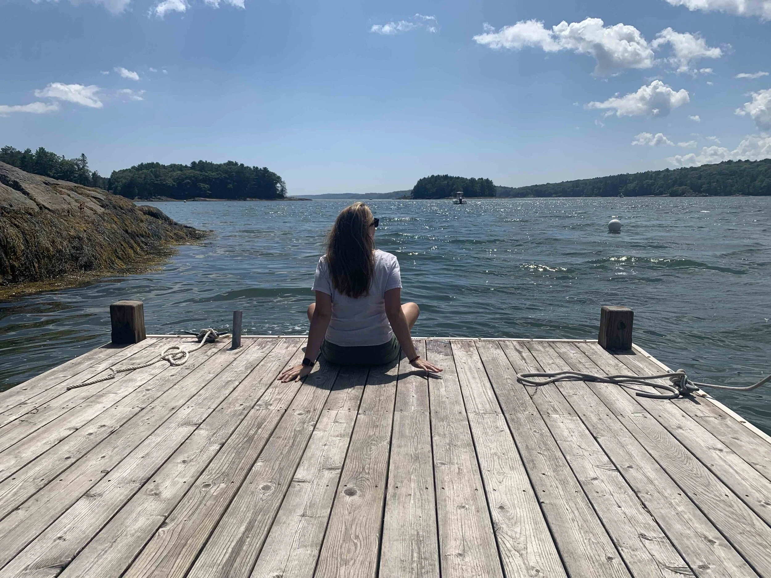
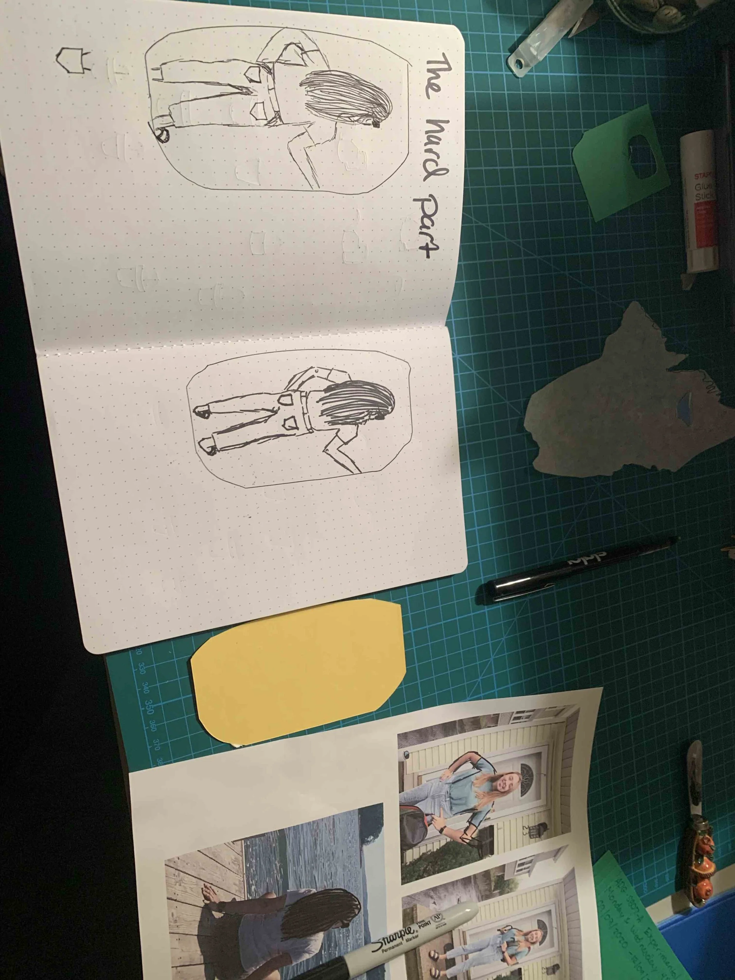
I would practice my drawing a few times before drawing on the colorful paper. As you can see in my notebook “hard part” was drawing myself and I feel like I am horrible at drawing faces so I just wanted to draw inspiration from a photo of my back.
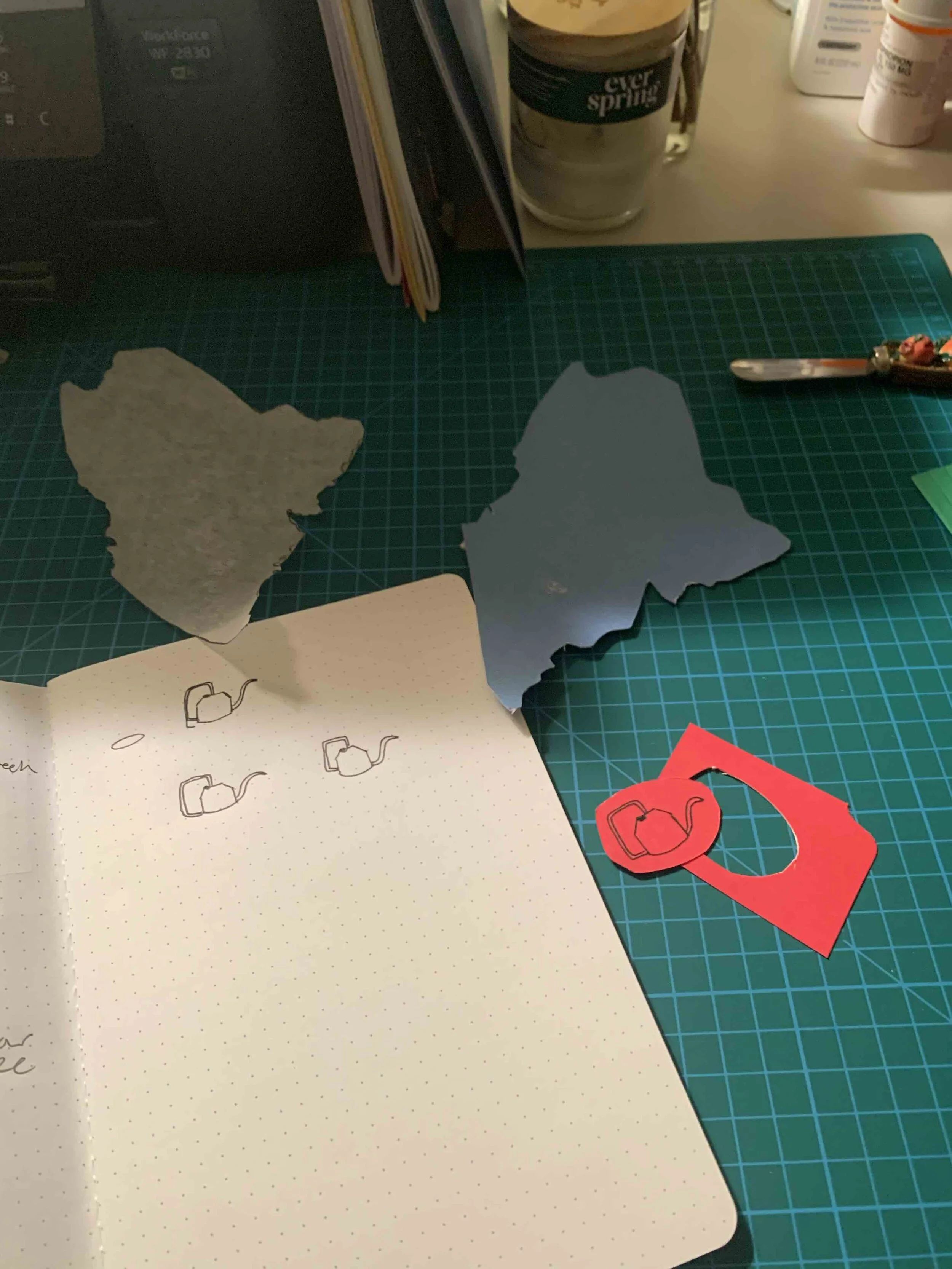
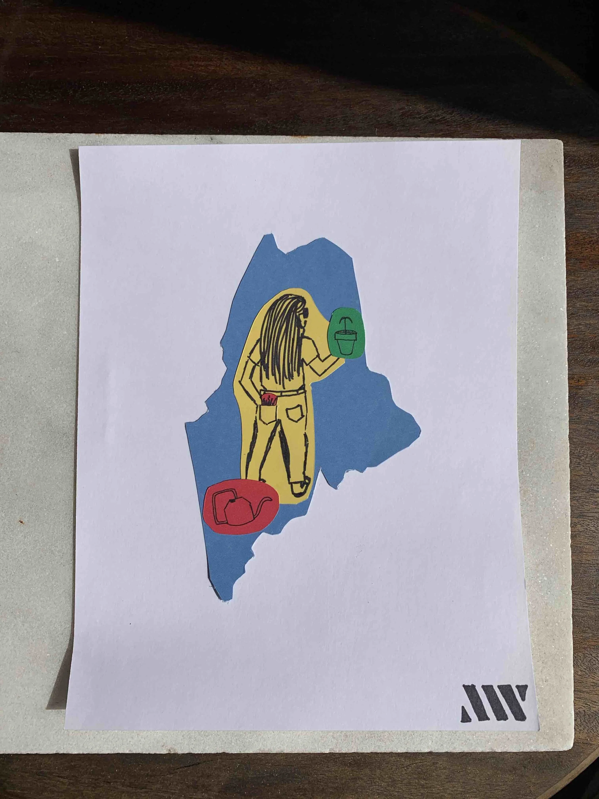
The final composition is the state of Maine cut out in blue because the Maine flag is mostly blue. The plant is green, the watering can is red because one of my watering cans is orange and then I am in yellow! With french fries in my back pocket :) In the last picture you can see that I mounted my little self portrait on a white card stock page and I finished it off with my logo in the corner just a simple “this was made by me”.
Elliot Earl Reaction
It was interesting. I don’t think I found it as repulsive as some of my peers. The jumpy nature of the video didn’t bother me its similar to a lot of the videos I watch. Something that is like it but not about design is this sewing vlogger named Micarah Tewar's here is her recreation of Ariana Grandes grammy dress https://www.youtube.com/c/MicarahTewers/videos she has a similar disjointed and side winding narrative that I like.
As for his thesis of the video it made sense to me but the phraseology was a bit discouraging. I agree with the description of the two camps in design There are the innovators and boundary pushers on the other hand there are the corporate designers who stay within stricter boundaries.
I kind of see this as a spectrum there are designers like Elliot who create zany unique designs. The other end of the spectrum I see designers who work at print shops or production they are really just pushing other peoples work through to a printer. Are people on one end of the spectrum better known than the other side? YES! But that does make them inherently better than one another? NO.
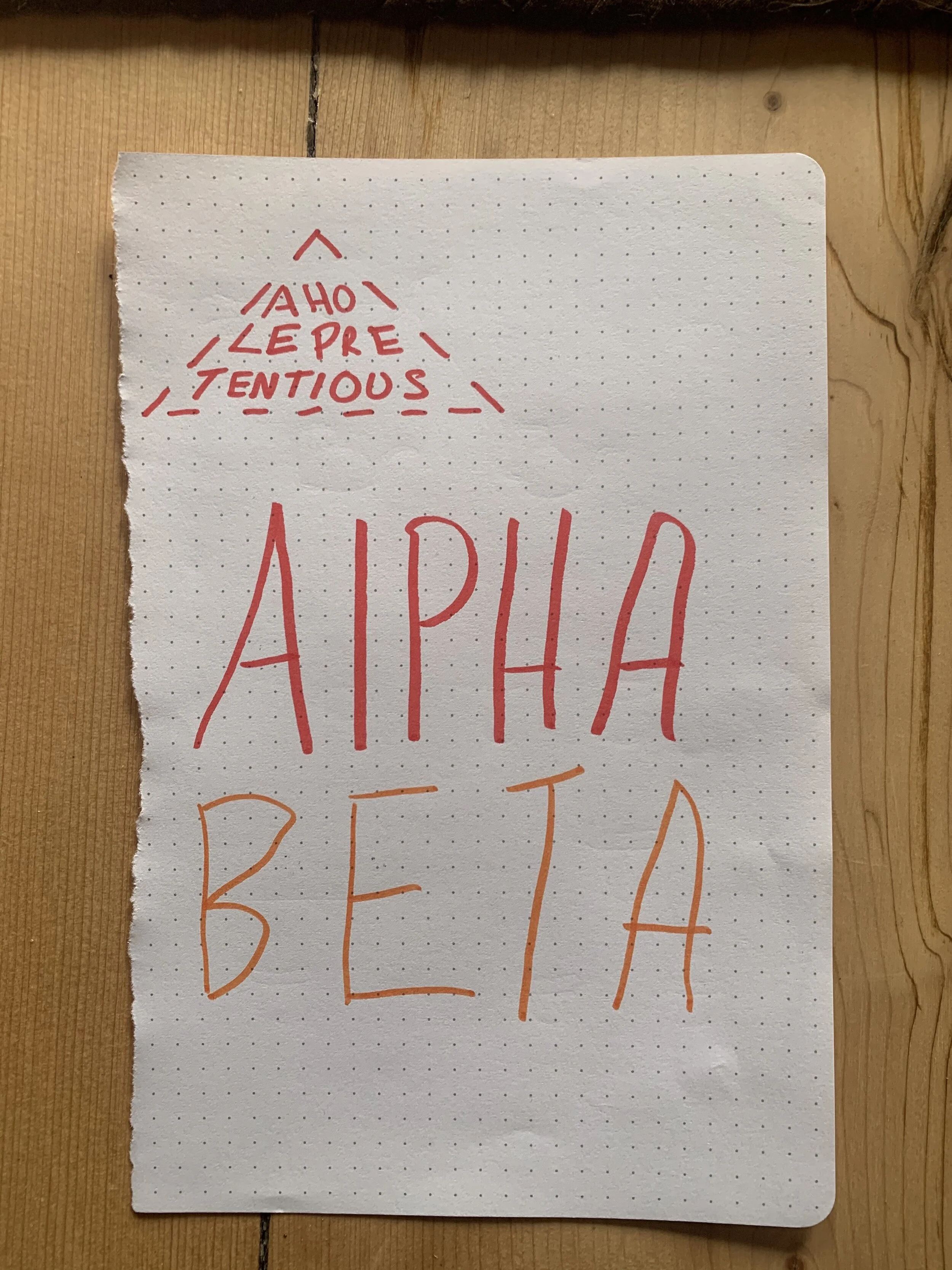
I think other folks hit the same point I felt about the language of alpha-beta but I thought it was really reductive and there wasn't anything to support his argument other than I'm right and you’re wrong.
Overall very thought provoking and definitely a good note to start the course because it seems to have stirred a lot of emotions!